Conversion rate optimization: guide & tips
Do you already have a lot of traffic on your site, but the conversions are lagging too far behind? Then the idea of conversion rate optimization is just the right thing for you. Here you can find out what it includes, what the strongest measures are and how to avoid typical mistakes.
.avif)
What is conversion rate optimization?
Conversion rate optimization (CRO) is the process by which you develop your website or landing page so that a higher proportion of visitors take the desired action, i.e. buy, sign up, or get in touch.
The idea behind this is simple: You've already calculated visitors to your site and the conversion rate. To get more conversions, you have two options at this point: Flush more visitors onto the page, for example via ads. Or drive more sales with the same number of visitors, i.e. increase the rate of conversions.
Conversion rate optimization is often equated or confused with superficial measures: more buttons, brighter colors, a pop-up here, a countdown there. That has little to do with real optimization.
Done right, CRO is based on three things:
- Understand: How are users behaving on your site? Where do they break off? What might prevent them from taking action?
- Test: Which changes are demonstrably improving user behavior?
- Improve: What can be implemented over the long term to stabilize or increase results?
Requirements for conversion rate optimization
The prerequisites for meaningful conversion rate optimization are clean tracking, a clear goal definition and sufficient traffic on the site. Without this basis, you run the risk of drawing wrong conclusions or worsening functioning elements.
Clean tracking
Many believe they have tracking that works just because Google Analytics is built in. But whether it really provides useful data is another question altogether.
If you want to optimize your conversion rate, you need to be able to see exactly what happens on your side and where Users opt out. This is only possible with:
- specifically recorded actions, such as clicks on CTAs, scrolling behavior, entries in form fields
- clearly defined Conversion goals, which are only triggered once per session, even technically (e.g. after a successful order, not every time a page is accessed)
- Segments with which you differentials Can recognize by device, channel, or campaign
It is therefore not a question of having as much data as possible, but the right data.
You need answers to questions like:
“How many people start the checkout but then cancel? ”
“Does traffic come from a source that actually suits the target group? ”
“Do desktop and mobile work equally well, or are there big differences? And why? ”
2. Defining the goal of conversion rate optimization
Before you start the actual conversion rate optimization, you should know where you want to optimize and what should be improved. This requires a tiered target system:
a) Primary objectives — the actual business objective
That is the action that counts in the end. For example:
- Conclusion of purchase
- submitted form
- Sign up for a trial
This goal should be clearly defined per page. A landing page where you have to choose between three things will rarely work well. If you want everything, you often end up with nothing.
b) Secondary goals: micro-conversions
Not every visitor buys right away. But many are doing things that point in the right direction:
- A product is called
- The shopping cart is opened
- A form is filled out but not sent
These micro-conversions help you identify hurdles in the process. Perhaps 80% of users will drop out in the last step of the form. Then it's not the whole funnel that's broken, but that's where the crux of the matter lies.
c) Metrics that represent business benefits
A conversion is good. But how much does it yield? If you know the average order value (AOV), for example, you can better assess the economic effect of your optimization.
A higher conversion rate with a lower AOV can pay off worse than a stable CR with a higher shopping cart value.
3. Traffic as a statistical basis
To evaluate whether variant B performs better than variant A, you need a sufficient sample size. Because no pattern can yet be derived from the behavior of just a few users.
The following applies to classic A/B tests:
- Minimum 1,000—2,000 sessions per variant
- Conversion goal with at least 50-100 conversions per version
- Running time of at least one week, ideal: due to several days of the week and traffic fluctuations
If you don't reach these thresholds, you shouldn't proceed quantitatively, but qualitatively first: with heat maps, session replays, or user interviews.
Tip: You can find out more about this in our article on A/B testing.
The strongest conversion rate optimization measures
User navigation and page structure, content and reasoning, design and usability, trust and credibility, and call-to-action (CTA) have the strongest effect on conversion rates.
a) User navigation & site structure
If the visitor doesn't understand what they should do or why they should stay at all, you'll lose them within seconds.
Key questions:
- What does the user see first? (Above the fold = directly visible when loading for the first time, without scrolling)
- Is there a clear focus on the page? Or are there multiple messages competing?
- Is your gaze drawn naturally, or do you always have to orient yourself?
What helps:
- Make a clear main message directly visible
- Fewer options, not more
- Omit what doesn't contribute to the decision
b) Content & Reasoning
People are most willing to buy and act when there is the prospect of severe pain being alleviated (pain) or a desire being fulfilled (need). When the offer then impresses with clarity, benefit and trust, nothing stands in the way of a successful conversion. The content on your site must support this.
- Is it immediately apparent what is being offered and for whom?
- Do you immediately address a strong pain or need?
- Are you talking about the product or the benefit for the user?
- Is the most common objection addressed immediately, e.g. price, effort, risk?
What helps:
- User-centered language (“You get...” instead of “We offer...”)
- Breakdown into small, easy-to-understand sections
- Examples, positive customer feedback, concrete benefits instead of empty promises
c) Design & usability
Design is not only appearance, but also function and therefore results directly in usability. Small barriers have a big, negative effect.
Typical issues:
- Mobile display neglected
- Buttons that are too small, poorly placed forms
- Distraction due to too many colors, animations, menu items
What helps:
- Think mobile-first, but don't neglect your desktop
- Visual guidance: What is important, what is optional?
- As little friction as possible, e.g. autofill, no mandatory fields without reason
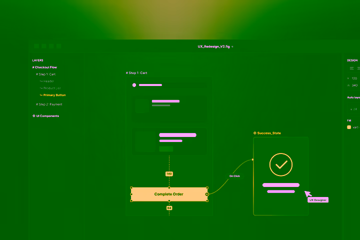
d) Call to action (CTA)
The CTA is the moment of decision. On many pages that are still facing conversion rate optimization, the CTA is too unclear, too late or simply invisible.
- Is the CTA immediately visible without scrolling?
- Is it clear what happens when I click? (“Buy now” is clearer than “Continue”)
- Does the CTA come often enough but not too often?
What helps:
- Accurate, active language (“Test now”, “Save appointment”)
- Visibility: rich in contrast, anchored in reading guidance
- Repetition, but carefully. Best: Place contextually appropriate (e.g. after a section with elements of trust)
e) Trust & Credibility
When there is doubt, no one converts. It takes a high level of trust to give your money or data out of hand. This is particularly true for new brands, expensive products or sensitive services.
- Customer testimonials with a genuine connection to the product
- Clear contact options (telephone number, location, legal notice)
- Guarantee promises, money-back options
- Data protection signals (e.g. GDPR notice, security certificates)
- Social proof (number of customers, known references, media reports)
The rule of thumb:
The bigger the decision or risk, the more important is visible trust.
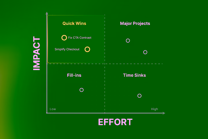
Typical mistakes in conversion rate optimization
Many conversion rate optimization projects start with a lot of motivation and then ship out. Not because the topic is too complex, but because fundamental thinking mistakes are being made. Here are the most common pitfalls and how to avoid them.
1st mistake: Optimizing without understanding the problem
Just because someone writes that green buttons work better doesn't mean it's true on your site. Always work based on your user understanding, directly related to your target customers.
- Analyze first: Where do users drop out? What do they see anyway? What don't they click on?
- Use session replays, heat maps, surveys
- Reconcile what the user is presented with his deep-seated pain/need over and over again.
2nd mistake: Design ≠ effect
A nicer page isn't automatically a better site. At first glance, some redesigns look more modern and then perform worse because structure, recognition, or trust have been lost.
- Don't ask, “Do we like that? ”
- Instead: “Does the user understand more quickly what they should do and why? ”
- Optics are only a means to an end, but never the goal. Unless it is directly part of your product.
3rd mistake: Change everything at once
Anyone who rebuilds five things at once and is even successful with them still doesn't know in the end what has worked and what may have even harmed it.
- Always make changes individually and gradually
- During tests: change only one variable at a time
- Formulate a hypothesis beforehand: “We believe that X improves conversion because...”
4th mistake: Just look at the conversion rate
A higher conversion rate sounds good. But what if you get worse customers, lower shopping carts, or higher return rates?
- Always evaluate the conversion rate in connection with other key figures: Average Order Value (AOV), Customer Lifetime Value (CLV), return rate, support costs
- The goal is not only “more” but also “better”
5th mistake: Set expectations unrealistically high
In conversion rate optimization, there is rarely the one big change that solves all problems at once. And certainly not overnight. Many good optimizations provide an improvement of 5 to 15%, which is huge in the long run.
- Think long term
- Document successes, even small ones
- Make decisions based on them, not euphorize
Required frequency of conversion rate optimizations
The longer the time that you allow between two rounds of optimization on the same page, the further that page remains below its options. This is because technical options are improving, user behavior and the spirit of the times are changing, and expectations are shifting.
That doesn't mean you have to constantly rebuild everything. But: Anyone who doesn't touch anything for years sometimes gives away a lot of potential and gives competitors the lead over those who see conversion rate optimization as an integral part of their workflow.

On the other hand, if you continuously optimize, you always push your site's performance close to the upper limit of possibilities. From here, it also happens that you create breakthrough combinations that keep you ahead of the market from time to time.

How to work on conversion rate optimization in the long term
Anchor the CRO as an integral part of your marketing efforts and workflow.
- It must not be an exception, but must be regarded as an ongoing task.
- Establish a test and analysis routine: Monthly review of the CR, develop new hypotheses, specifically test, implement, observe.
- Document what works and what doesn't. Not every test gives a big or new result. But every insight always takes you one step further.
Are you stuck with your conversion rate optimization?
We at Axisbits know from the experience of numerous website and landing page projects that conversion rate optimization can be very detailed and time-consuming.
When the performance of your pages Always driving below your expectations And if you are sure that more needs to be done there, a neutral view from outside may help.
Your shop should implement more, your landing page deliver more leads and is there still too much room in your pipeline?
Maybe it's time for a neutral look at your content, landing pages, and the entire website. Together, we can develop a roadmap that allows your sales to rise again. Get in touch with us and we'll show you how we approach optimizing your site's conversion rate.
{{fs-btn-cta}}
Wir schaffen leistungsstarke Plattformen und Websites für Startups, Scale-Ups und KMUs, von Konzept bis Go-Live.
We create high-converting websites and landing pages for start-ups, scale-ups and SMEs, from concept to go-live.
Conversion rate optimization — common questions and answers
No, conversion rate optimization does not mean blindly constantly tinkering with new elements. It is about optimizing areas where there is real friction. When a page is working, you should primarily watch it. CRO also means letting go when it makes sense, but being prepared to make targeted improvements as soon as a bottleneck appears.
Yes, if you optimize not only for more conversions but for the right users, you can specifically promote high-quality leads or purchases. Example: If you get too many irrelevant inquiries, you can reduce conversion through more targeted wording or deliberately set hurdles, but increase relevance. CRO is therefore also a tool for qualification, not just for improvement.
If you have less than ~1,000 visitors/month, classic conversion optimization with tests is often not yet worthwhile. Here, it makes more sense to set up the channel stably first. But: You should fix basic UX errors, unclear CTAs, or technical barriers right away, no matter how little traffic there is.
Contradictions are normal. Some users click on “Learn more” but then jump off. Others scroll down to the footer but don't convert. What is important is that not every action is a signal of interest. Always ask yourself: Which action really contributes to the goal of the site? And analyze patterns in context, not in isolation.
More articles

Just two years ago, building a first functional software prototype took several weeks: setting up the development environment, cobbling together a backend, building a frontend, wiring it all together. Today it takes a few hours and a clear prompt. AI Prototyping has fundamentally changed the process.
68% of all website visitors leave a page after less than 10 seconds, which is almost 7,000 lost customers per month on an average website. The common reason: poor UX design. In this article, you'll learn what UX design is and how you can use it for your business right away.
If you buy expensive traffic and then the users jump off again in rows, it's time for UX optimization. In this article, you'll learn more about the benefits and ROI, troubleshooting, and proven measures to optimize UX.