
Brand Identity for a Saffron Merchant
Project overview
Development of a consistent and high-quality brand identity for House of Saffron to become the central point of contact for Safran in Switzerland.
House of Saffron offers high-quality saffron in Switzerland and already had a logo, which was however too detailed and hard to read in digital applications. The brand was not visually consistent and could not convey its premium claim clearly enough. At the same time, the identity was meant to respectfully reflect the cultural origin and support the ambition to become the go-to place for saffron in Switzerland.
The biggest hurdles lay in simplifying the existing logo, defining a suitable typography and developing a color palette that conveys exclusivity without feeling overloaded.
- Comprehensive analysis
Carrying out a detailed customer questionnaire to identify the target group, emotional commitment and desired brand representation. - Logo redesign
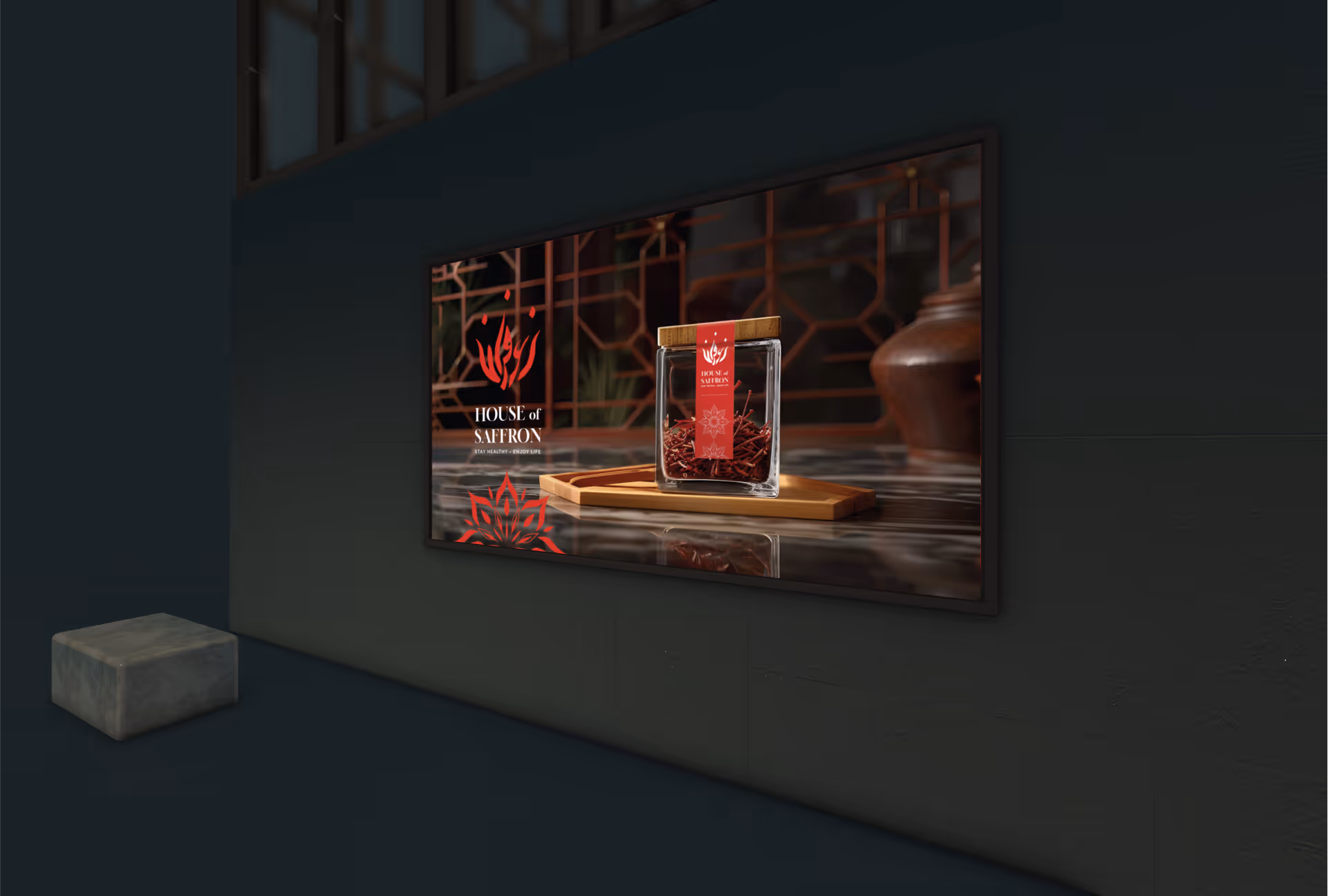
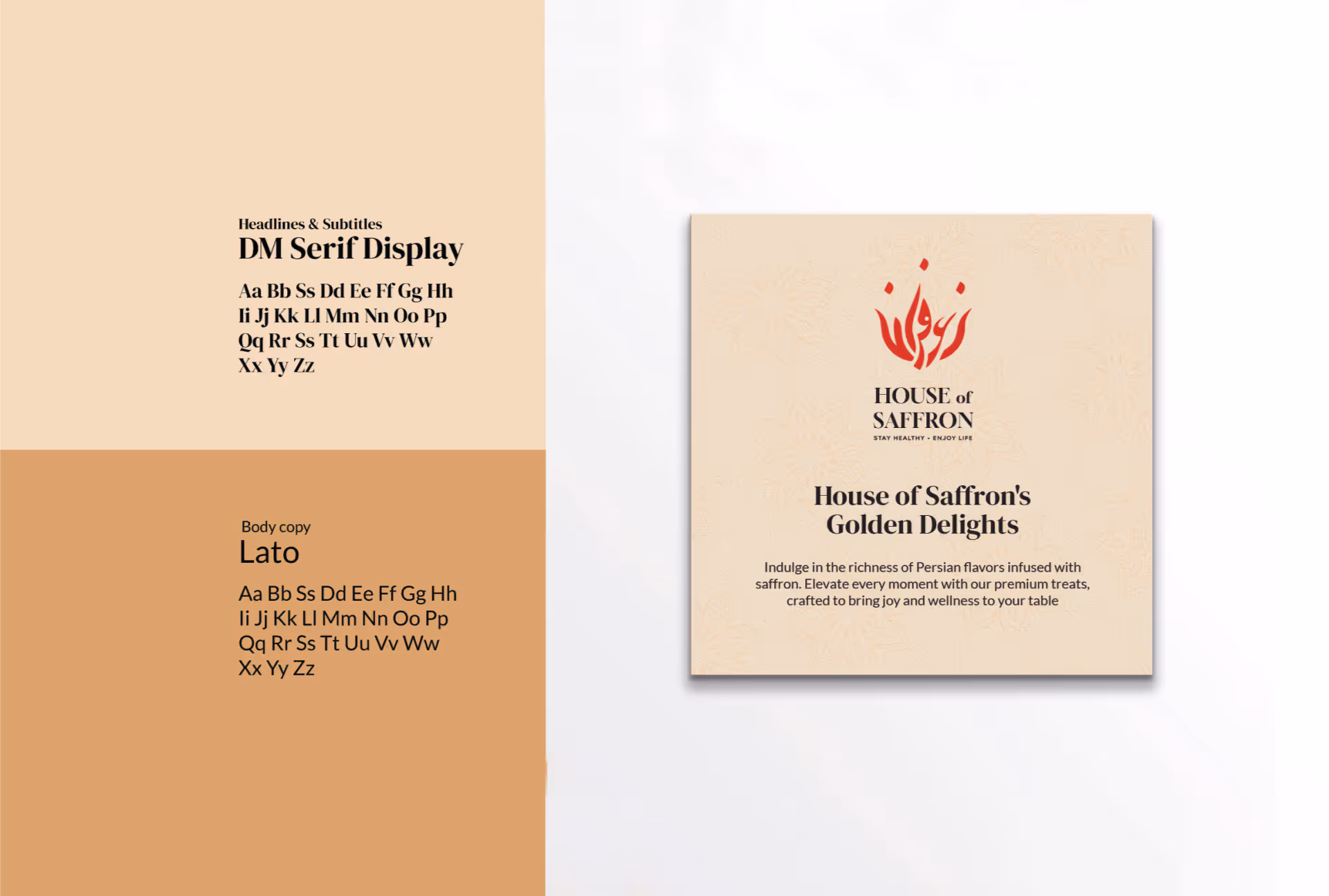
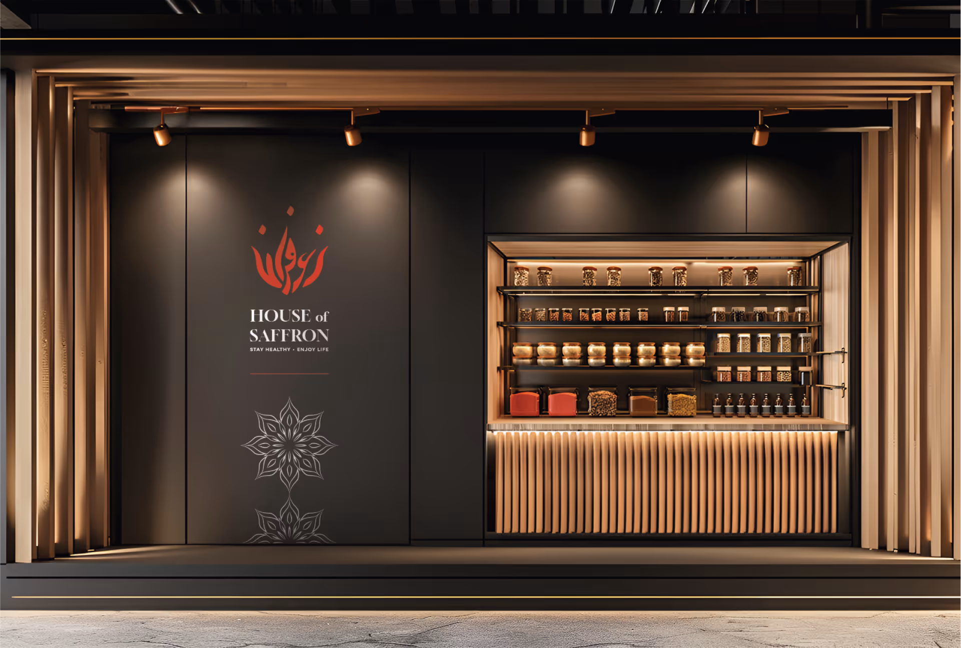
Development of a minimalistic and modern logo that optimizes readability in digital media. - Typography selection
Implementation of serif fonts that combine elegance and tradition. - Color palette development
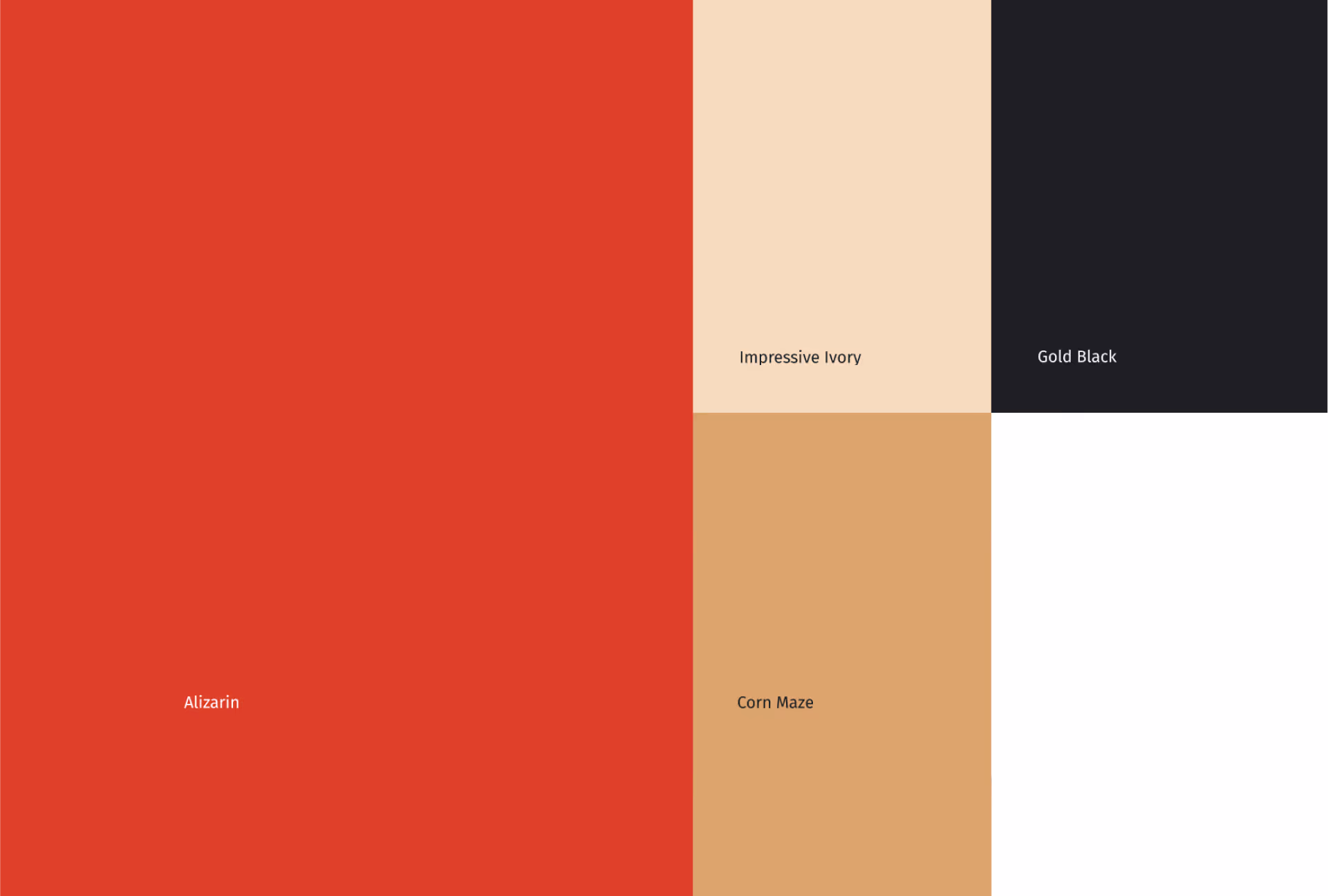
Creating a balanced color palette that communicates high quality and exclusivity.
- Strong brand identity
A high-quality identity that highlights Iranian roots and the exclusivity of saffron. - Consistent appearance
A visually appealing, consistent presence across all media. - Increased recognizability
More brand recognition and professionalism. - Central positioning
A branding that supports House of Saffron as a central point of contact for Safran in Switzerland.


- Overly complex logo with low digital readability
- Inconsistent visual appearance
- Low recognition value in the digital space
- Minimized, precise logo for web and print
- Consistent brand identity with clear color and typography language
- Higher recognizability and stronger premium impression
Is your project our next?
Tell us what you're up to. We'll tell you within 30 minutes what's possible and whether we're the right person for it.
More Case Studies


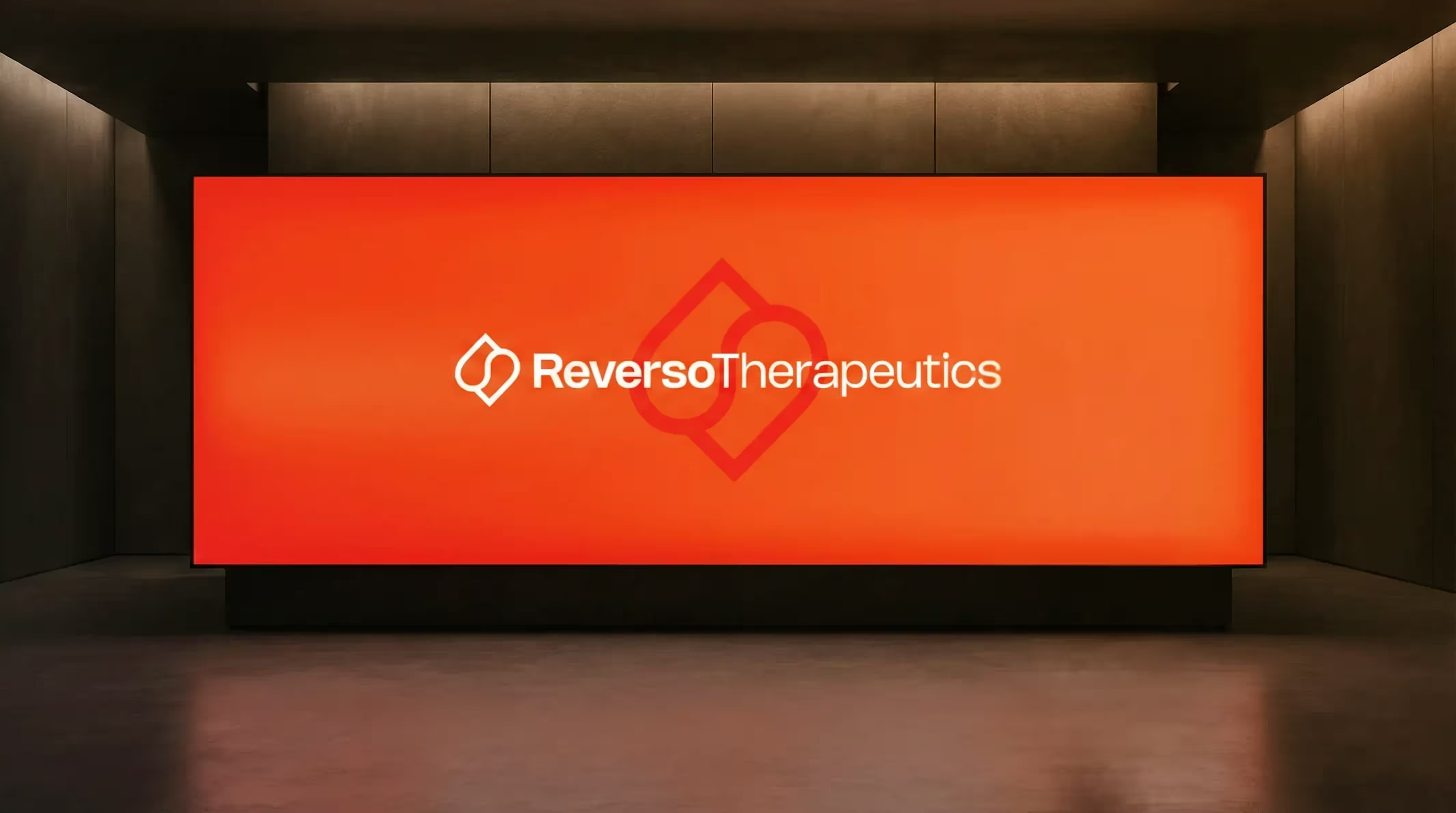

Rebranding for a Geneva University Pharma Spin-off
For Reverso Therapeutics, a spin-off of the University of Geneva in the field of next-gen anticoagulation, we developed a precise and recognizable branding. The result strengthens their position with researchers, partners and investors.
These Are
Your Next Steps
In the Project Check, we discuss your project and your goals.
We define the best solution and plan implementation, effort and time frame.
We realize your vision, support you all the way to go-live and beyond.
Take the first step towards implementation.
In 30 minutes, we will review your project, provide personal advice and show you the path from vision to implementation.
