
Rebranding for a Freelancer App
Project overview
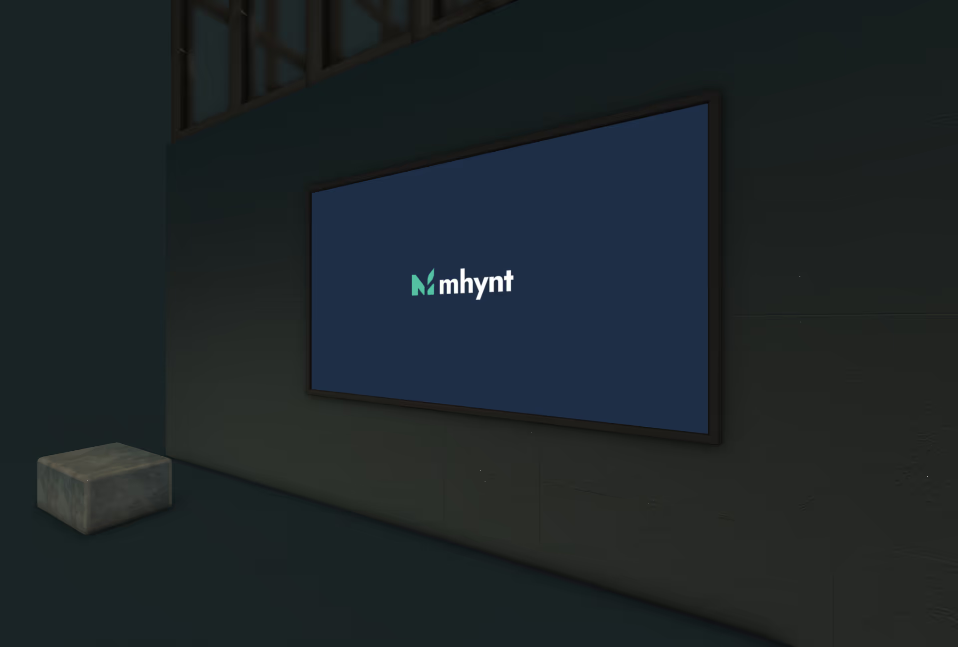
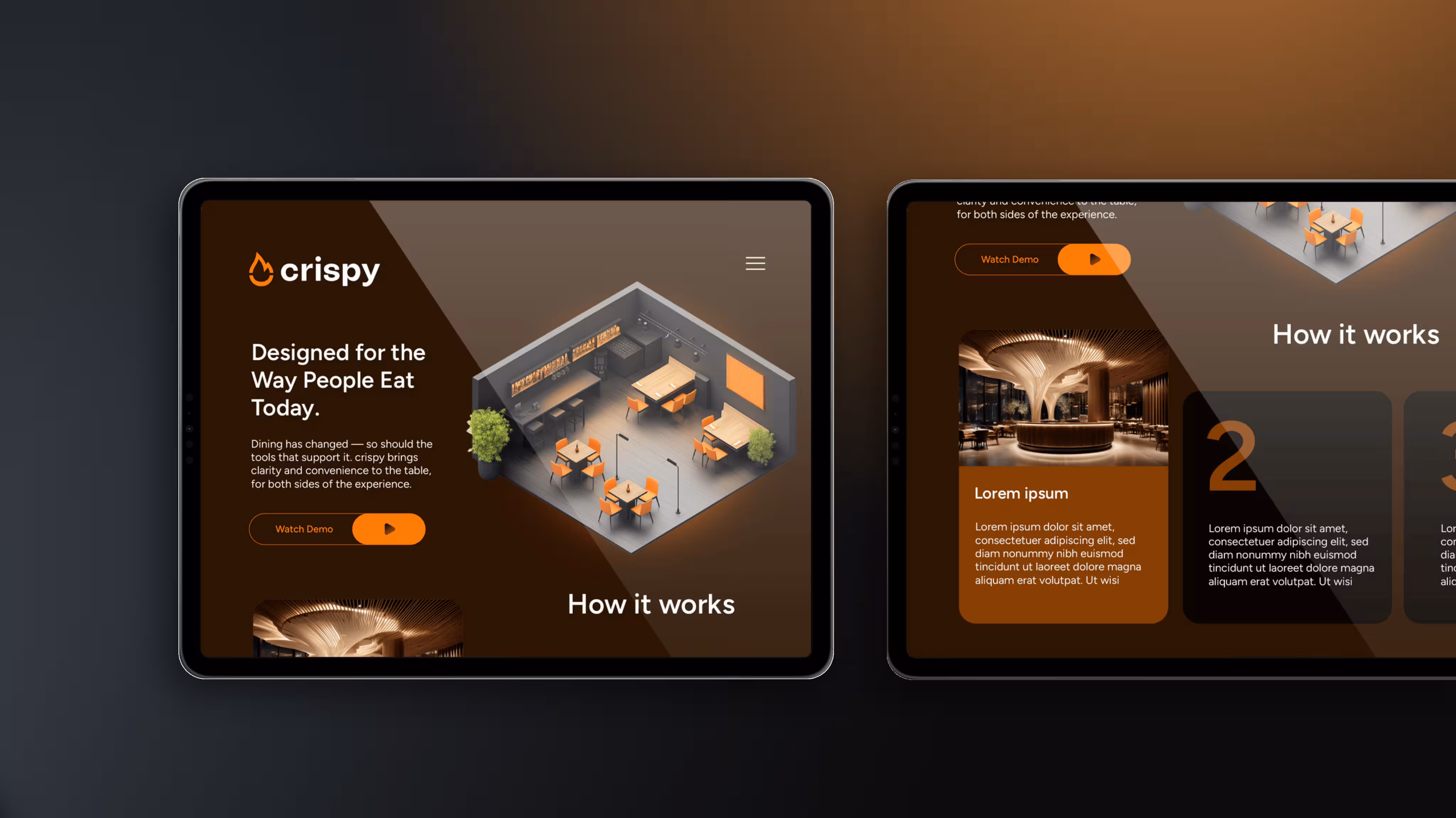
Transformation of The Freelance Suite brand into mhynt, a trusted pricing and profit maximization app for freelancers in the UK.
The brand of the SaaS tool existed, but did not come across as consistent or professional enough in the market. Color palettes and typography were inconsistent, style and components were missing – both visually and verbally. For a target group of freelancers who calculate prices and sell services every day, this was an obstacle to trust and growth. A brand modernization was needed.
- In-depth analysis
Implementation of a comprehensive questionnaire to record customer visions, emotional aspects and target group characteristics. Analysis of existing brand positioning and identification of potential for improvement. - Iterative design processes
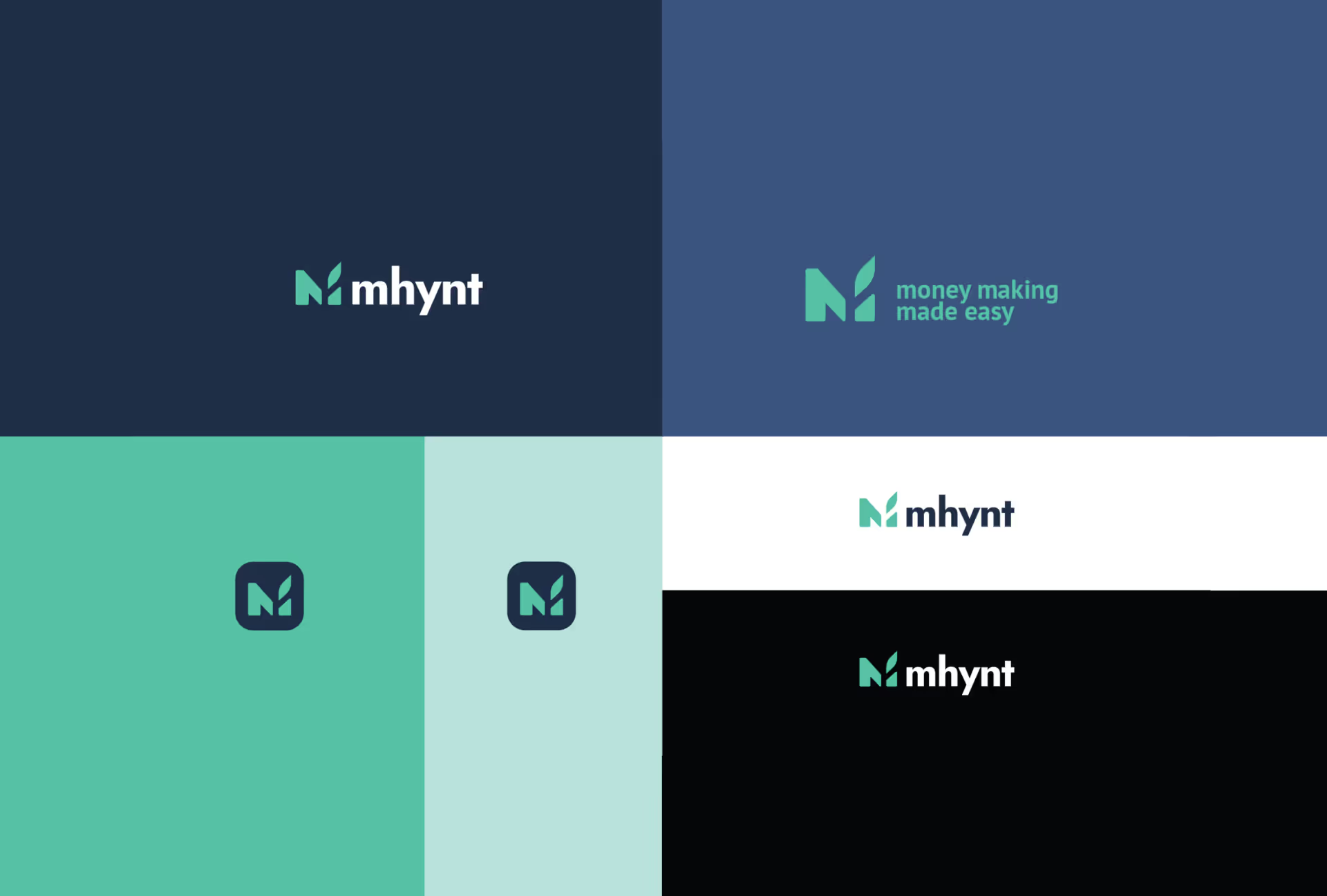
Development of two distinctive logo variants based on the analysis results. Continuous adjustments to achieve optimal compliance with customer expectations. - Holistic brand development
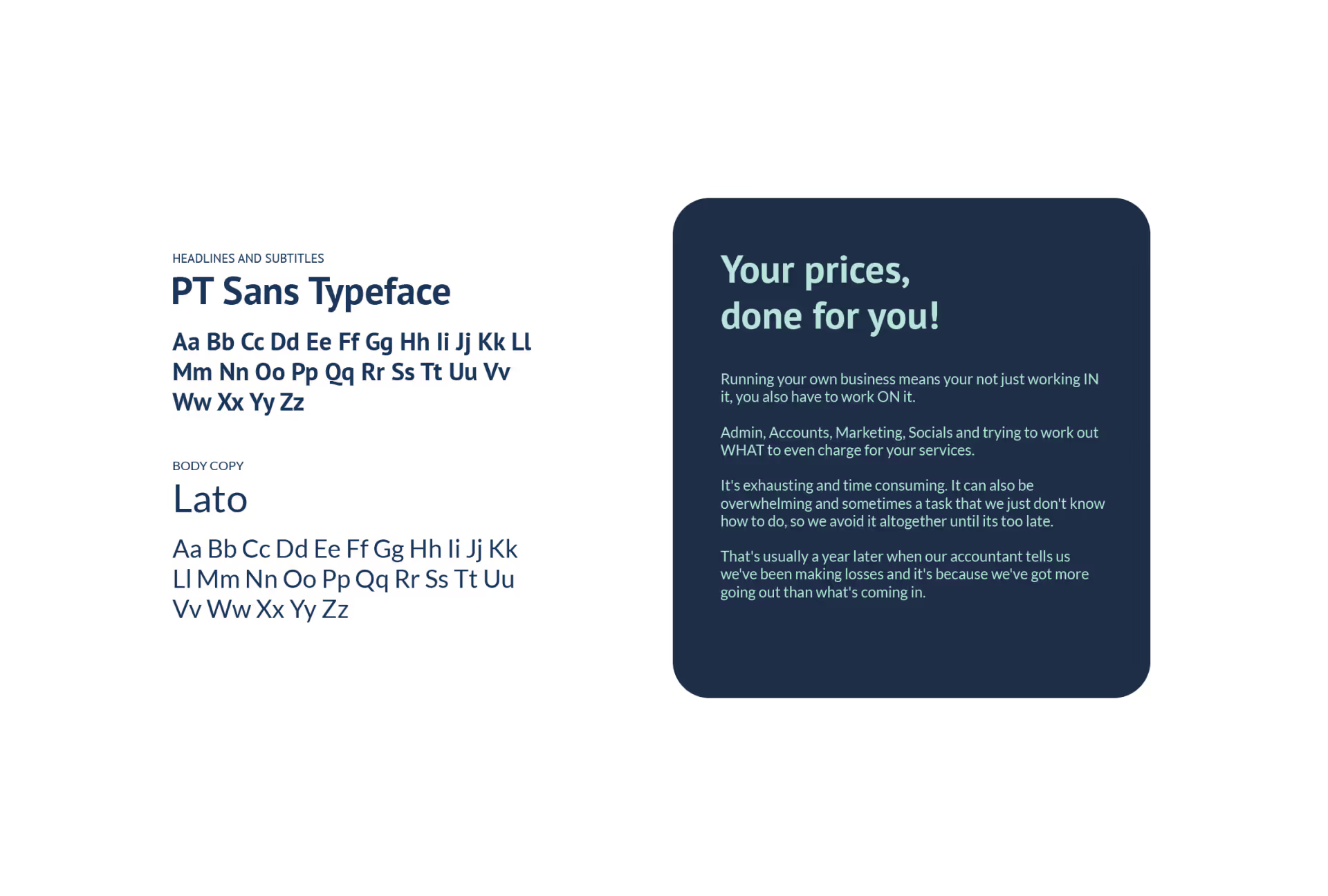
Development of a coherent brand identity that covers all aspects of the visual and verbal presence. Create guidelines for consistent branding across all channels. - Implementation and rollout
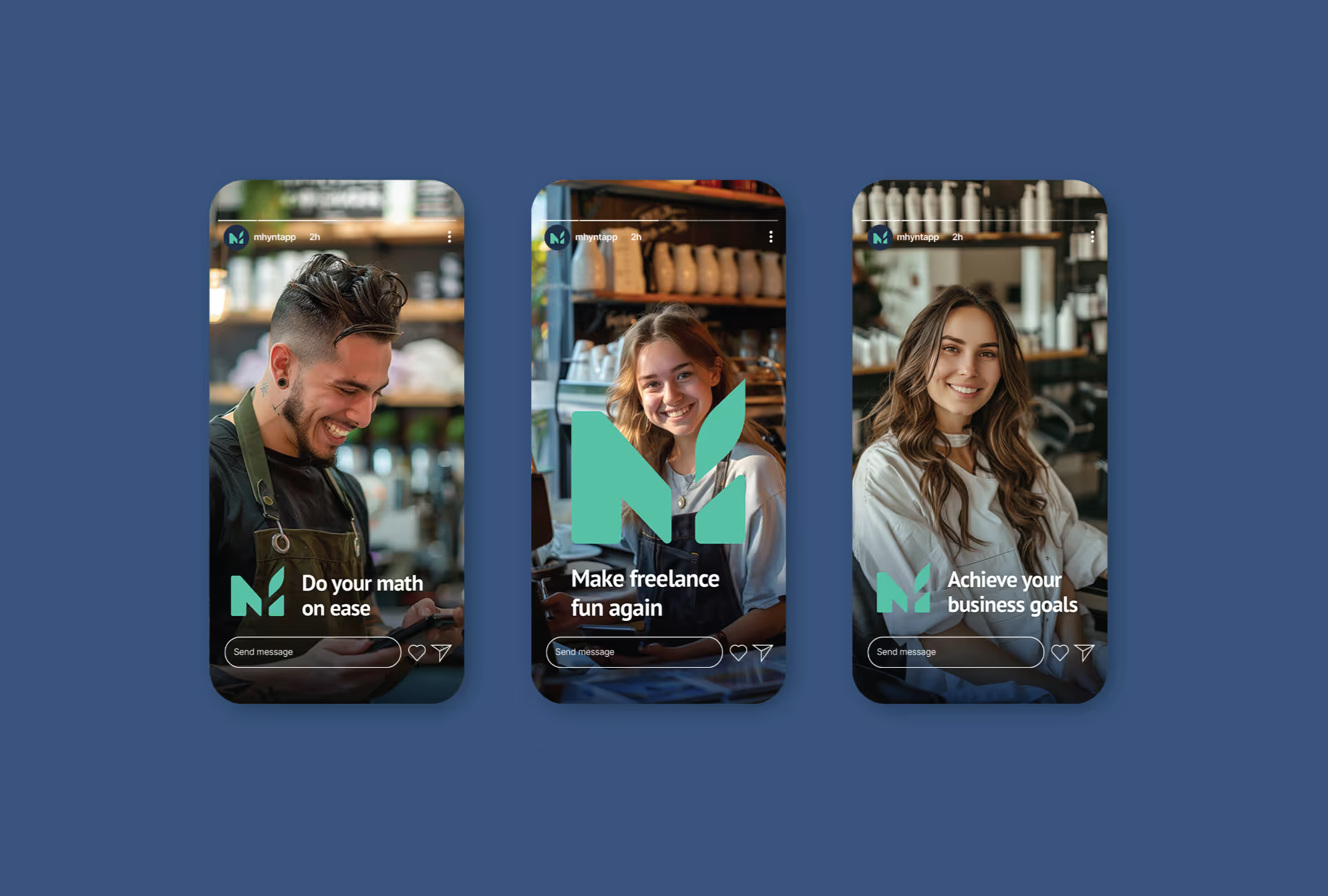
Implementation of the new branding on the website, in the app and on all relevant social media platforms. Training the customer team to correctly apply the new brand identity.
- Increased brand perception
The new brand identity leads to a significant increase in brand awareness and recognition. - Improved user experience
The coherent design across all touchpoints results in a more intuitive and pleasant user experience. - Positive customer response
Surveys showed a significantly improved perception of the brand as trustworthy and professional.
Excellent communication. Work was delivered according to and beyond brief. Very trustworthy, patient and they always bring good additional creative input to the project. Very happy with the collaboration.


- Inconsistent brand image with weak visual impact.
- Color and font choices without a clear structure.
- Brand appearance was less professional and trustworthy.
- Well-conceived brand identity with color palette, typography and component style.
- Clear brand application across all channels for consistent communication.
- Professional and trustworthy appearance for the freelancer target group.
Is your project our next?
Tell us what you're up to. We'll tell you within 30 minutes what's possible and whether we're the right person for it.
More Case Studies


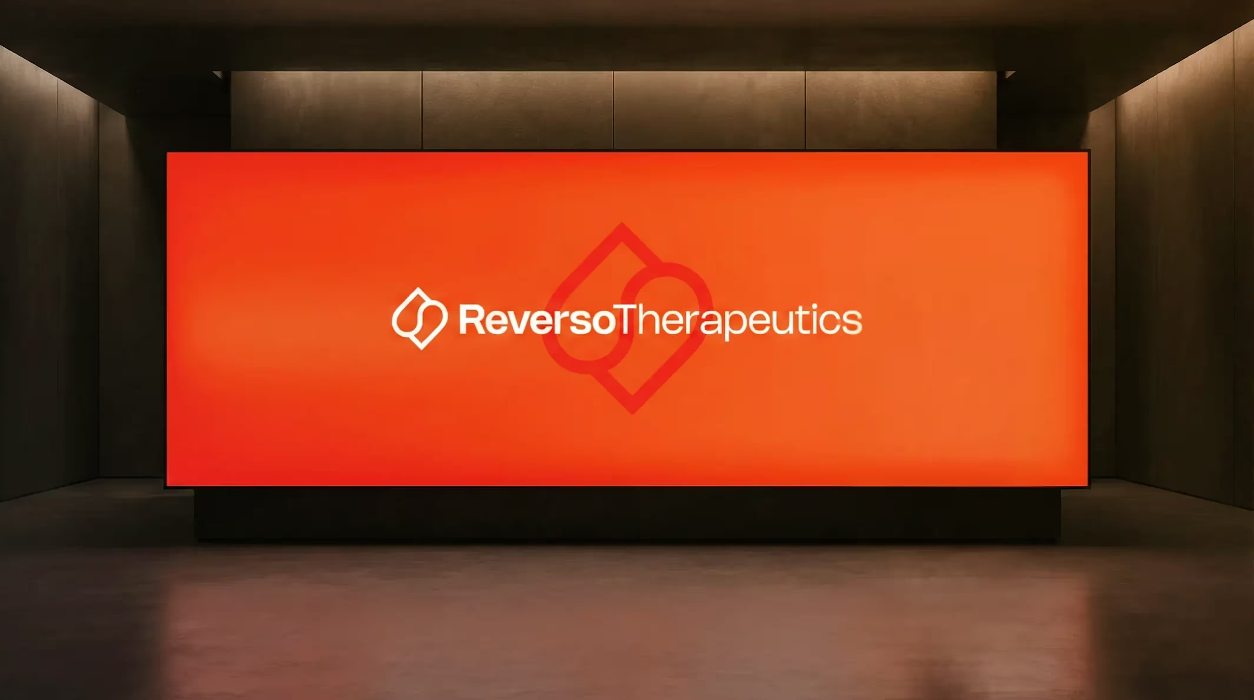

Rebranding for a Geneva University Pharma Spin-off
For Reverso Therapeutics, a spin-off of the University of Geneva in the field of next-gen anticoagulation, we developed a precise and recognizable branding. The result strengthens their position with researchers, partners and investors.
These Are
Your Next Steps
In the Projekt Check, we discuss your project and your goals.
We define the best solution and plan implementation, effort and time frame.
We realize your vision, support you all the way to go-live and beyond.
Take the first step towards implementation.
In 30 minutes, we will review your project, provide personal advice and show you the path from vision to implementation.
