
Rebranding for a FinTech Company
Project overview
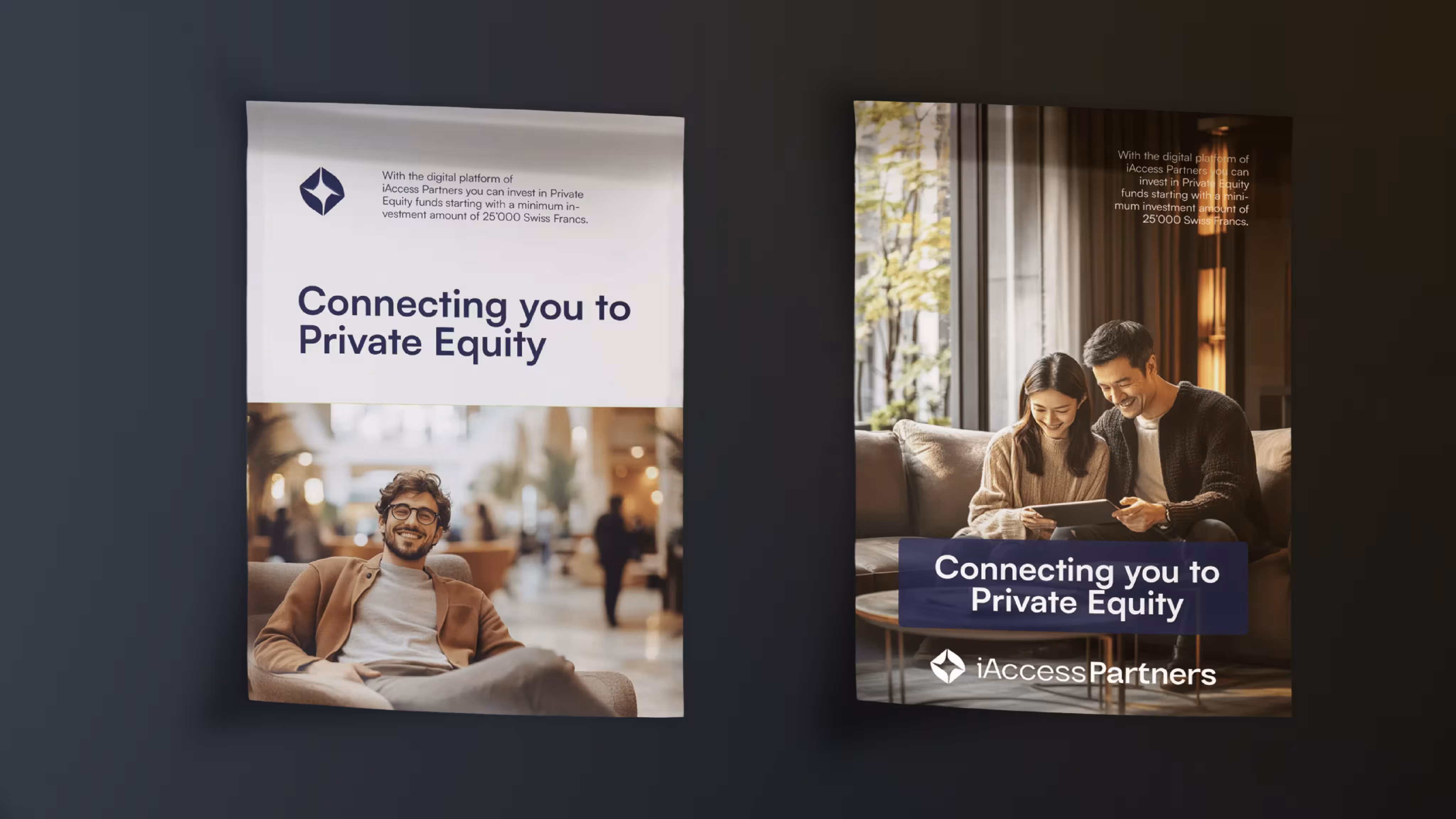
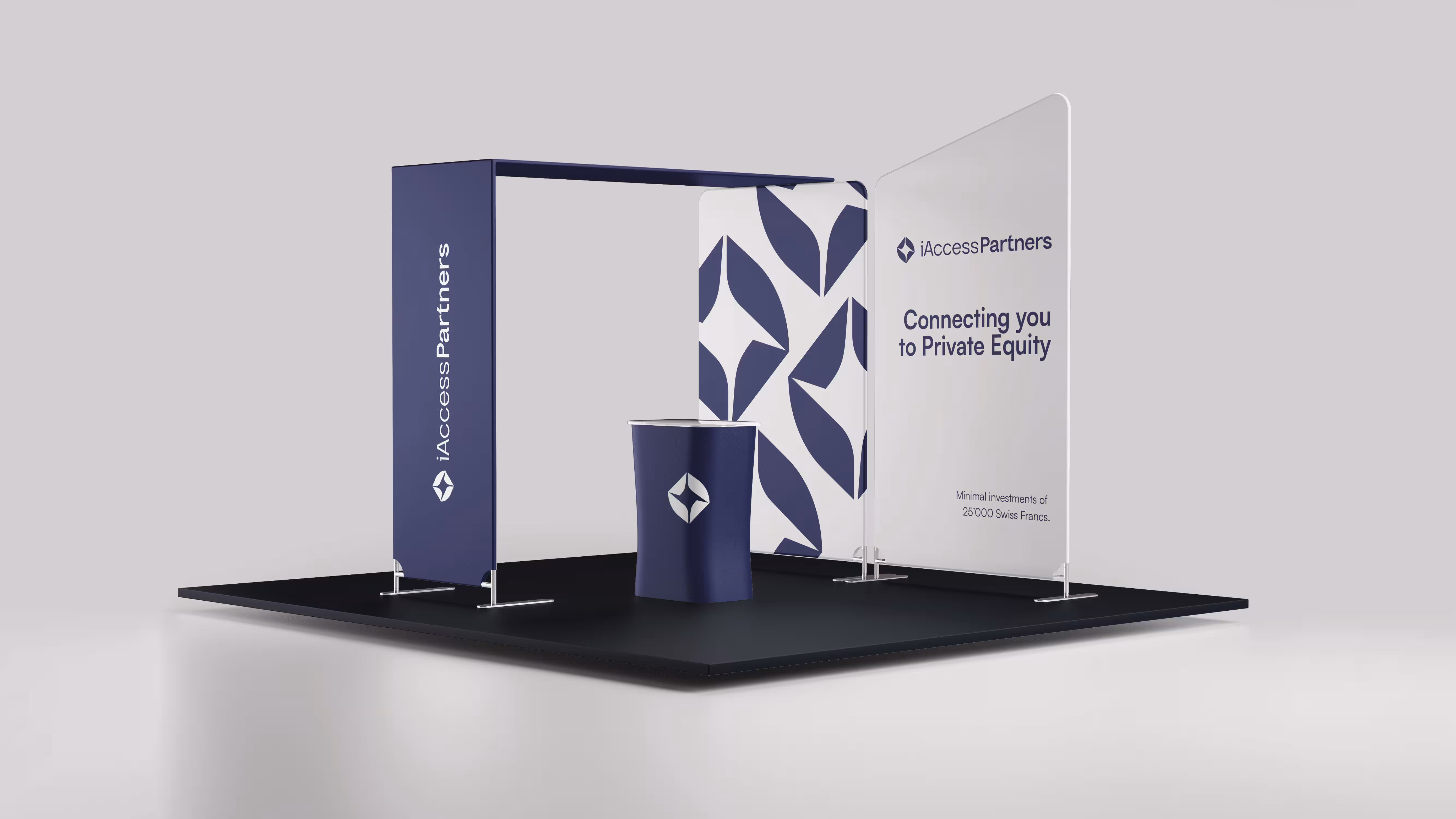
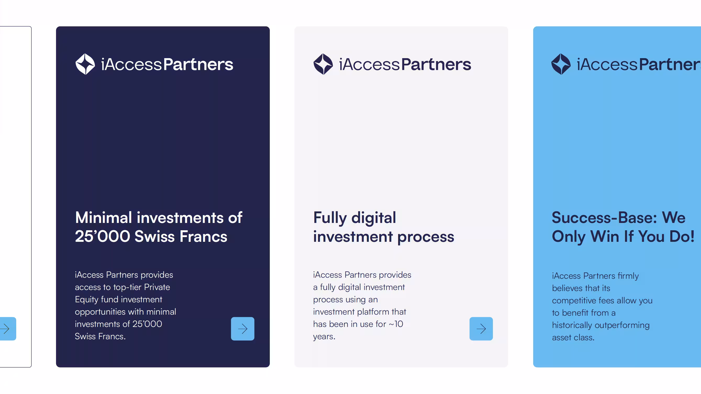
For iAccess Partners we developed a new branding: logo, color and typography system as well as a UI kit. This gives the brand a modern, trustworthy feel, ready for digital financial products.
iAccess Partners operates in the financial industry and provides private as well as institutional investors with access to private markets. Their existing brand image did not reflect the quality, the team and the modernity that truly characterize the company. The brand was not strong enough to build trust with demanding target groups such as financial intermediaries or major investors. An additional challenge: the appearance needed to be bold and modern on one hand, yet serious enough to appeal to finance and corporate clients on the other.

Together with the iAccess team we repositioned the brand image:
- Development of a new logo that conveys clarity and professionalism
- Definition of a color palette with shades of blue – established as a trustworthy, neutral base in the finance industry, yet interpreted in a modern way
- Build-up of a typography system that is flexibly applicable – from the website to presentations and social posts
- Creation of a UI kit in Figma with the core base components (buttons, cards, icons, color and text styles) – aligned to the subsequent website
- Compact brand book with mockups (e.g. brand presence on social media, PDF presentations) – so the team can efficiently produce their own assets in the new look
The new branding gives iAccess Partners a significantly stronger market presence. The brand now conveys both innovation and trust.
Effects:
- The team can produce new presentations, social posts and PDF documents faster and more consistently
- The visual presence strengthens the impact in pitches and when approaching major clients
- The foundation has been laid for the subsequent website implementation and future brand extensions
Axisbits fully convinced us with our rebranding and new website, really great work!


- The branding would have continued to not fully reflect the professionalism and modernity of the company.
- The effort for internal production of presentations, social posts or PDFs would have been higher.
- A coherent brand appearance as the foundation for the website and communication would have been missing.
- Clear, modern brand appearance with trust and solution orientation.
- Efficient UI kit and brand book that enables the team to create content independently and consistently.
- Strong foundation for the website implementation and future brand communication.
Is your project our next?
Tell us what you're up to. We'll tell you within 30 minutes what's possible and whether we're the right person for it.
More Case Studies


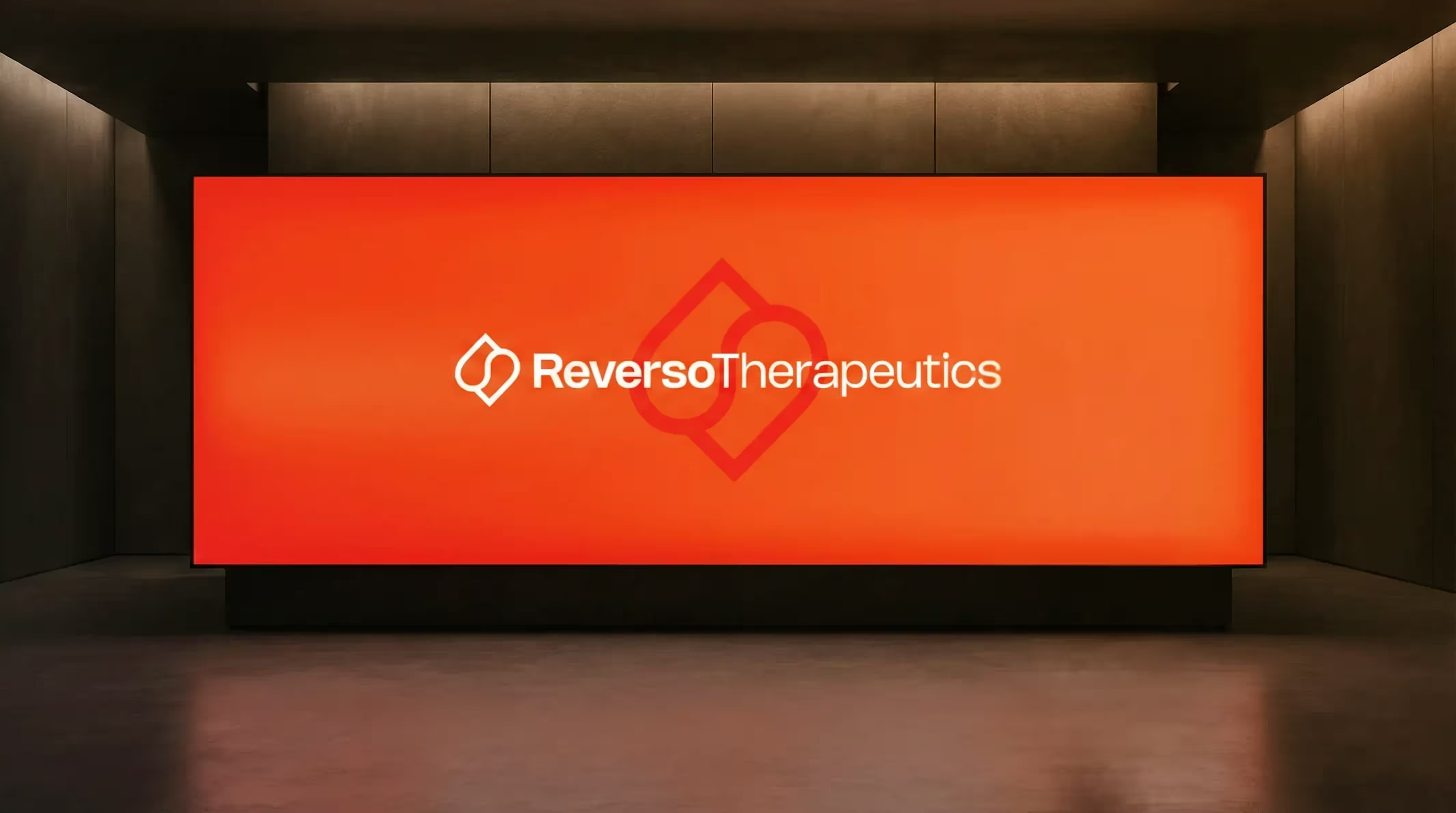

Rebranding for a Geneva University Pharma Spin-off
For Reverso Therapeutics, a spin-off of the University of Geneva in the field of next-gen anticoagulation, we developed a precise and recognizable branding. The result strengthens their position with researchers, partners and investors.
These Are
Your Next Steps
In the Project Check, we discuss your project and your goals.
We define the best solution and plan implementation, effort and time frame.
We realize your vision, support you all the way to go-live and beyond.
Take the first step towards implementation.
In 30 minutes, we will review your project, provide personal advice and show you the path from vision to implementation.
