UX design for beginners: basics, examples and first steps
68% of all website visitors leave a page after less than 10 seconds, which is almost 7,000 lost customers per month on an average website. The common reason: poor UX design. In this article, you'll learn what UX design is and how you can use it for your business right away.
What is UX design?
User experience design is concerned with how people experience digital products. A UX designer makes sure that you find your way around a website without thinking. That you can easily find what you’re looking for in an app. That an online purchase is completed in two minutes, not ten.
Counterexample: You click on a website and leave it after three seconds. Why? Because you don’t immediately understand what to do there. That is bad UX design.
Many confuse UX design with beautiful design. It’s not. UX design is invisible — you only notice it when it’s missing. It is the discipline that ensures that digital products work before they look beautiful.
Difference: UI vs. UX design
UX design plans the structure and functionality, UI design (user interface) designs the look — just like an architect and interior designer when building a house.
Imagine you’re building a house. The architect plans where the rooms are located, how they are connected and how the whole thing functions structurally. That is UX design. The interior designer then selects colours, furniture and materials. That is UI design.
Both disciplines are important and interlinked, but UX comes first. The best UI design can’t save a bad UX. Conversely, a well-thought-out UX can also work with mediocre UI — at least for a while.
An example of the difference between UI and UX design
Netflix, for example: the UX work is in the recommendation algorithm and the way content is categorised. Netflix analyses what you watch, when you stop, and which genres you prefer. From this, UX researchers develop a system that suggests relevant content to you. They also decide that the most important options — Play, My List, Rate — are immediately visible when you hover over a title.
You can then see the UI work in the thumbnails, colour scheme and hover effects. UI designers choose the red brand colour for the play button, design the fonts and make the thumbnail images slightly larger when hovering. They decide whether the “My List” button gets a plus icon or a bookmark icon.
The 5 basic principles of UX design
Within UX design, five principles determine whether your digital product works or fails: user-centred design, simplicity, consistency, accessibility, and continuous improvement.
User-centred design in UX
The user decides what is good based on their behaviour. Not the designer, their boss, or anyone else. That sounds obvious, but it is the most common problem in product development. Teams build features that they themselves find cool. They optimise for scenarios that never occur in reality. They solve problems that their users don’t even have.
User-centred design means: you talk to real people before you start building. You create personas — not as fantasy characters, but based on real interviews and data. You observe how people actually use your product, not how you think they should use it.
Amazon has perfected this. The “1-click order” was created not because someone thought “that would be technically possible”, but because Amazon saw that users dropped off in complicated checkout processes. They optimised for the real user problem: “I want to buy, but the process is too cumbersome.”
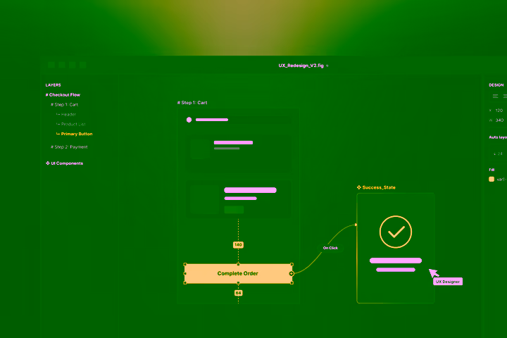
.webp)
Simplicity and clarity in UX
“Don’t make me think” is the most important UX principle of all. Every second that a user has to think is a lost second. But every decision you make for them makes your digital product better. That doesn’t mean you leave out features. It means that you present them in a way that makes them intuitively understandable.
Google understood this when all other search engines filled their home pages with links, news and advertising. Google offered a search box — and that was it. That was radical in 1998 and still works the same way today.
Simplicity also means setting priorities. When everything is important, nothing is important. Highlight what really counts. Hide details in sub-menus. Guide the user step by step through complex processes instead of showing them everything at once.

Consistency of UX design
Users learn your system once. Then they subconsciously expect it to work the same everywhere. Consistency creates trust.
If the “Save” button is sometimes on the right, sometimes on the left, sometimes green, sometimes blue, the user has to relearn every time. That is exhausting and frustrating.
Apple has made consistency an art. The basic gestures and interactions always work the same on an iPhone, iPad or Mac. Anyone who has learned to zoom with two fingers can do so on all Apple devices.
Consistency doesn’t just apply within your product. You should also follow industry standards. Users expect a shopping cart icon to lead to their cart. That a hamburger menu (the three horizontal lines ≡) opens the main menu. That links are blue and underlined. Be creative with problem-solving, not with conventions.
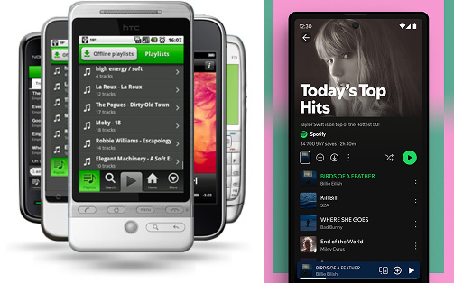
.jpeg)
Accessibility in UX design
Accessibility means that your product can also be used by people with disabilities: visually impaired people who use screen readers, deaf people who depend on subtitles, people with motor disabilities who can’t click precisely.
Accessibility helps everyone: subtitles are also helpful for people with normal hearing in loud environments, large buttons are more pleasant to tap on smartphones, and high contrast makes text easier to read in sunlight.
Microsoft has shown with its Inclusive Design Toolkit that barrier-free design means planning for the diversity of users right from the start, without compromising on quality.
Iteratively test and improve UX design
UX design is never finished and evolves with your users. The best UX work happens after launch. Then you see how real users use your product in everyday life. They do things you never expected. They encounter problems that didn’t show up in your tests.
Spotify has changed its app many times since 2008. Not because the old version was bad, but because user habits change. New features are added and new devices emerge. What was optimal five years ago may be out of date today.
Iterative testing means: regularly questioning whether what you’ve built is still the right solution.
Examples of successful UX designs
These three cases show how UX design optimisations solve real business problems: Baileigh Industrial increased website findability by 85%, Spotify reached 40 million weekly users with Discover Weekly, and Nike achieved 82% more online revenue through digital transformation.
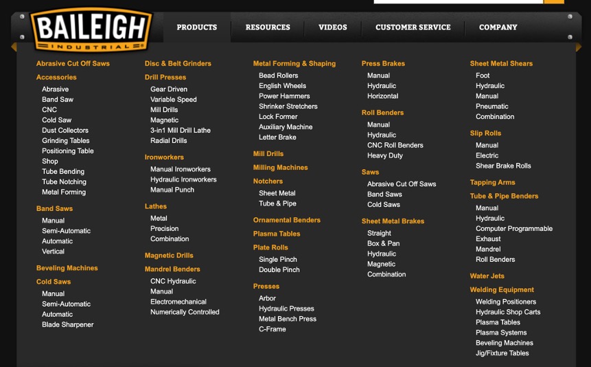
UX design example 1: Baileigh Industrial’s navigation revolution (B2B website)
Baileigh Industrial, a manufacturer of metalworking machines, had a classic B2B problem: customers couldn’t find what they were looking for on the website. The result: countless calls to sales for simple product questions.
Marketade’s UX analysis revealed a disastrous findability rate of just 4 out of 10 points. Customers wandered through a category structure that no one but internal staff understood. A typical problem: anyone looking for a bending machine for 6 mm sheet metal didn’t know whether to look under “manual bending machines”, “workshop equipment” or “sheet metal processing”.
Marketade’s solution was radical: a complete rebuild of the information architecture based on real customer needs. Instead of internal categories, they used the language of the customers. Tree tests with 64 real users validated every step.
The result: 85% improvement in findability metrics. Customers can now find what they need in seconds. Sales can focus on complex consulting instead of acting as a telephone search service.
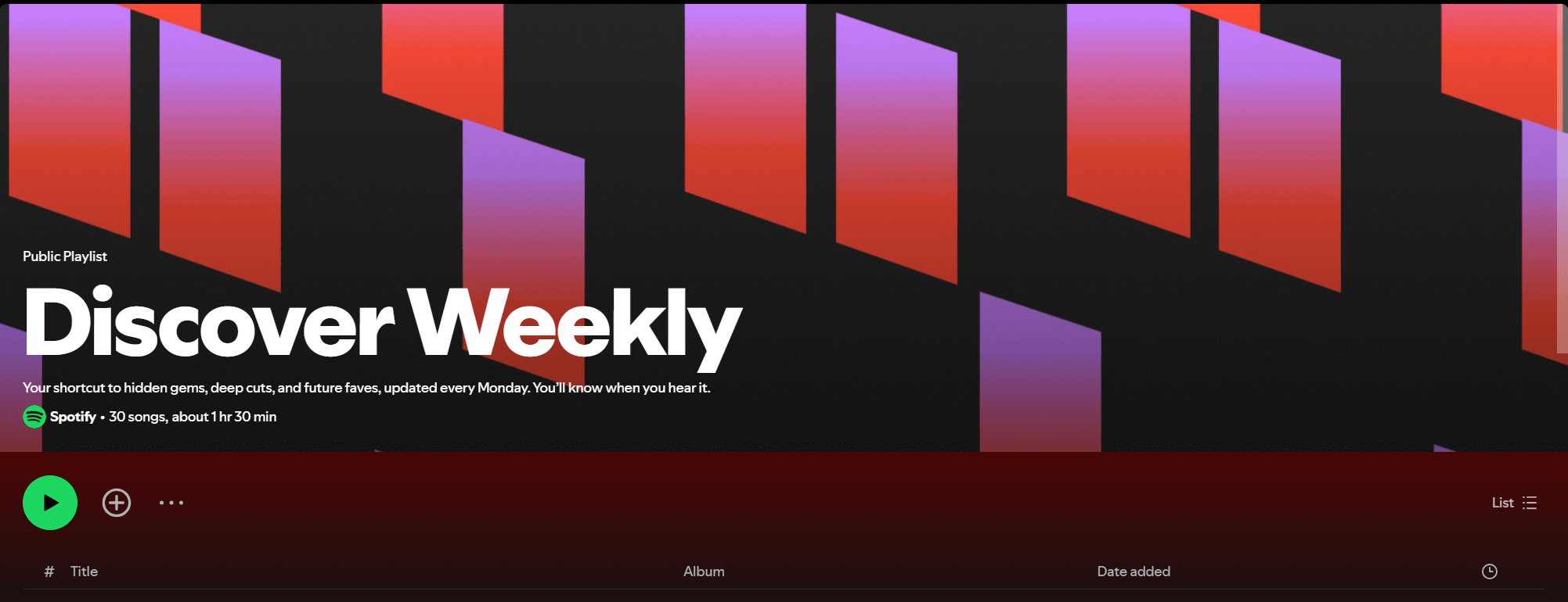
UX design example 2: Spotify’s Discover Weekly success
Spotify had a paradox in 2015: 30 million songs in the catalogue, but users always listened to the same music. The problem wasn’t the selection, but the discovery of new content.
UX research showed: users wanted new music, but only music that matched their taste. Existing recommendation features still worked poorly — too generic, too imprecise and too boring.
Spotify’s solution was Discover Weekly: a personalised playlist with 30 new songs every Monday. The system combines three AI approaches:
- Collaborative filtering (what do similar users listen to)
- Natural language processing (what does the internet write about songs)
- Audio analysis (how do the songs sound).
The result: 40 million people listen to their Discover Weekly playlist every week. 5 billion songs have been discovered via the feature. Spotify went from a music library to a discovery tool, massively increasing user engagement.
UX design example 3: Retail transformation at Nike
Nike identified a problem in 2010: the young target group (15–25 years) was no longer responding to traditional TV advertising. This group bought 20% more than others, but was active digitally.
The UX strategy was drastic: 40% less TV budget, but more investment in digital touchpoints. Nike built an ecosystem of apps (Nike+, SNKRS), personalised experiences and other online services.
Nike+ was the breakthrough: a platform that tracks training, shows progress and allows you to share these figures with others. Instead of just selling shoes, Nike became a fitness partner. The data collected fed into product development and personalised recommendations.
The result: 82% increase in online sales between 2019 and 2022. Over 200 million digital touchpoints daily. Nike transformed from a product manufacturer into a lifestyle platform, and the business figures reflect this success.
.png)
Tip: If you want to develop an app yourself, you can find our complete guide from idea to store here.
Why is UX design so important for companies?
The positive impact of UX design can be enormous for companies. Forrester Research shows an average 100:1 ROI for UX investments — in other words, every dollar spent on UX design pays off by a factor of one hundred. Companies like McAfee reduced support costs by 90%, and design-focused companies are growing 32% faster according to McKinsey. UX design is therefore one of the most profitable business investments.
But why is UX so profitable? Because it solves multiple business problems at once. Better UX:
- reduces drop-off rates
- increases conversion rates
- reduces support requests
UX design acts as a lever: small improvements have big effects. If you increase your conversion rate from 2% to 3%, that’s an increase of 50%. Your revenue therefore increases by 50%. For an online shop with 100,000 monthly visitors, that means 1,000 additional customers per month.
Common UX problems and their costs
The most expensive UX mistakes are:
- Complicated checkout processes (68% abandonment rate on average)
- slow load times (every second costs 7% in conversions)
- unclear navigation (40% of users leave a website immediately if they can’t find their way around).
Calculation example: a Swiss online shop with 500,000 francs monthly revenue loses around 125,000 francs in potential income due to poor UX. That’s 1.5 million francs per year — enough to finance an entire UX team.
There are also hidden costs: more support requests mean higher staffing costs, frustrated customers leave bad reviews, and employees waste time on work that wouldn’t be necessary.
UX design as a competitive advantage
In saturated markets, it is often not the best product that counts, but the best experience. A Capgemini study with over 3,300 consumers shows: 81% of customers are willing to pay more for a better customer experience. PwC found that companies can command a price premium of up to 16% for superior experiences.
UX design creates an emotional connection to your brand. Customers don’t stay because of your features, but because of the feeling your product conveys. Apple is the best example: technically, other smartphones are often superior, but Apple dominates through superior UX.
Getting started: How to begin with UX design
For companies, UX starts with an honest audit of the current situation; for those interested in a career, it starts with targeted learning and portfolio building.
Getting started with UX design for companies
Start with a UX audit of your existing website or app. Invite five customers to complete typical tasks while you observe. You’ll be surprised how many problems you discover in two hours.
Simple tools provide immediate insights:
- Hotjar shows you where users click and drop off
- Google Analytics reveals which pages most people exit from
- Surveys with three simple questions — “What are you looking for here?”, “Can you find it?” and “What frustrates you?”
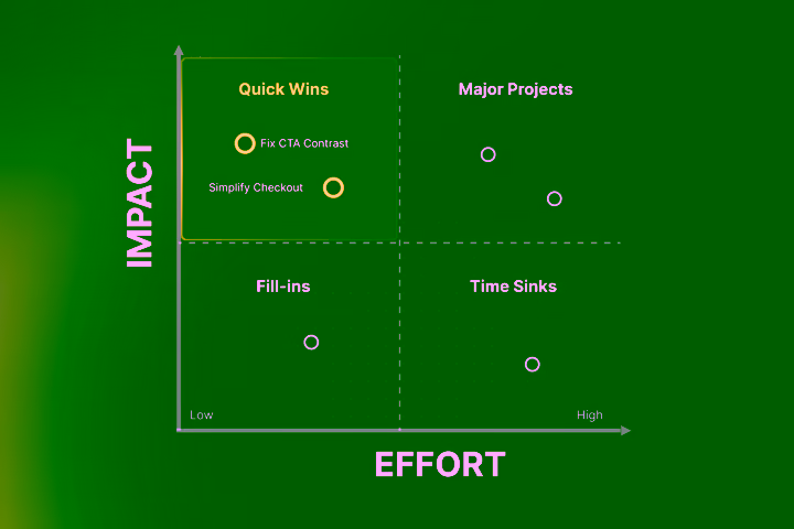
Set priorities according to the “quick wins” principle. Problems that affect many users and are easy to solve come first. Clearer button labels or a tidied-up form are often enough for measurable improvements.
Allocate 5–15% of your development budget to UX. That sounds like a lot, but it’s less than the costs that poor UX creates. A Swiss agency costs around 1,200–1,800 francs per day; a senior UX designer in-house costs 100,000–140,000 francs per year.
If you’re planning a completely new website, our guide shows how a professional website project works from idea to finished page.
Getting started with UX design for career changers
The best way to learn UX design is through practice, not theory. Start with free resources:
- Google UX Design Certificate on Coursera
- Nielsen Norman Group articles
- YouTube channels like “The Futur” or “CharliMarieTV”.
Build a portfolio right away — even without professional experience, and even if the steps feel too small at first. Find three bad websites or apps, analyse their problems and design improvement proposals. Document your thought process: why is the current design bad? How would you improve it? What would you test?
Learn the most important tools:
- Figma for prototyping
- Miro for user journey mapping
- Maze for simple testing
All have free versions that are sufficient to get started.
Network actively:
- UX Switzerland organises regular meetups in Zurich, Bern and Basel.
- Ladies that UX has chapters in the larger cities.
Many experienced UX designers are happy to share their knowledge. Politely ask for a coffee conversation in person.
In Switzerland, the starting salary for junior UX designers is 65,000–85,000 francs; with 3 to 5 years of experience, 85,000–110,000 francs. Senior UX designers earn 100,000–140,000 francs. Remote work is possible in 70% of UX jobs.
Read more: Topics you might find interesting
You now understand why UX design is so important. But perhaps you’re wondering: how do I actually implement this? How do I plan a digital project properly? Or how do I bring my idea to market quickly?
If you’re planning an online platform, our platform guide explains how to define functions and implement them technically.
Time to market plays a decisive role here: how do you bring your product to market quickly yet thoughtfully? Our article on Time to Market shows how to specifically shorten the period from idea to launch without sacrificing quality.
And if you want to know how much professional website development costs and how it works, our website guide covers all the important steps from planning to go-live.
Do you already have a project idea on the table and need help with implementation? Get in touch! Our experts at Axisbits will show you how we can help.
{{fs-btn-cta}}
Wir schaffen leistungsstarke Plattformen und Websites für Startups, Scale-Ups und KMUs, von Konzept bis Go-Live.
We create high-selling websites and landing pages for start-ups, scale-ups and SMEs, from concept to go-live
UX Design — Common Questions and Answers
A UX designer conducts user interviews to understand real needs. He creates personas (typical user profiles) and maps customer journeys to see where users have problems. He uses wireframes and prototypes to test solutions before they develop. He carries out usability tests, analyses data and optimizes based on real user behavior. In short: It ensures that digital products work for people, not just technically.
Yes, because UX design benefits from the knowledge of many other professional groups. Psychologists understand user behaviour, designers bring visual skills, and computer scientists understand technical feasibility. In Switzerland, the transition usually takes 6–12 months of intensive preparation (10–15 hours/week). Starting salary: 65,000–75,000 CHF, with experience up to 140,000 CHF. Hundreds of open UX positions in Switzerland demonstrate the high demand.
Free tools are enough to get started: Figma for prototyping, Miro for user journey mapping, Hotjar for user behavior analysis. For testing: Maze or UsabilityHub. Understanding UX principles is more important than expensive tools: user-centered design, simplicity, consistency, accessibility, and continuous improvement.
No, UX design is relevant wherever people interact with digital products. This includes e-commerce, banking, insurance, healthcare, education, government and traditional industries in digital transformation. A Swiss machine manufacturer also needs good UX for their website and digital services.
Simple UX improvements often have an immediate effect. Clearer button labels or tidy forms can bring measurable improvements within days. Larger UX projects take 3 to 6 months. Example: Baileigh Industrial increased website findability by 85% through navigation redesign. It took Nike several years to complete the digital transformation, but today sees 82% more online sales.
More articles
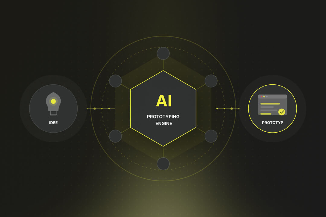
Just two years ago, building a first functional software prototype took several weeks: setting up the development environment, cobbling together a backend, building a frontend, wiring it all together. Today it takes a few hours and a clear prompt. AI Prototyping has fundamentally changed the process.
If you buy expensive traffic and then the users jump off again in rows, it's time for UX optimization. In this article, you'll learn more about the benefits and ROI, troubleshooting, and proven measures to optimize UX.

Do you put a lot of effort into shoveling visitors to your website, even running ads, but users don't want to buy or get in touch? The conversion rate mercilessly expresses this relationship in figures. In this article, you'll find out what the conversion rate really is and how to use it sensibly.