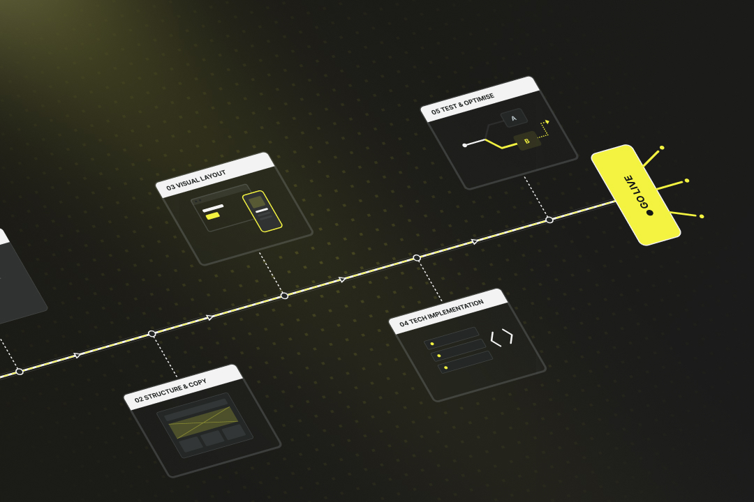
Guide: Create a landing page, test it, go live
If you want to collect leads or sell more effectively, a landing page is the right tool. This article contains the complete guide to creating your own landing page in 5 steps: 1. Define goal & target group: Set a clear target action and create a concrete persona. 2. Plan structure & content: Build a logical chain of arguments, create good copy. 3. Design the visual layout: Clear, responsive design with guided eye flow. 4. Technical implementation: Choose the right tools/platforms, sort out domain & hosting. 5. Test & optimise: Check before launch, then gather feedback and run A/B tests.
Step 1: Create concept, goal and target group
Before you get started with text, design, or technology, you need to clarify what your landing page actually amounts to. Because a good landing page is a strong chain of arguments with a defined goal.
a) What do you want your landing page to achieve?
Each landing page has exactly one task. The more you are aware of this, the easier it is to tailor the content and elements to it. Typical goals include:
- Have a contact form filled out
- Offer a download
- Sell a product
- Promote an event
- Trigger an application
The site may only lead to this one action. If you’re trying to accommodate multiple goals at the same time, you weaken the effect too much. This is because the user then no longer knows what to do.
Ask yourself specifically: What should happen in the end? How can I make the action as easy as possible for the visitor?
b) Who do you want to talk to?
The best landing page is useless if it ignores the target group. Therefore: Think carefully about who you’re building the site for and what that person needs to take action. Appropriate address is particularly important here.
Typical questions that will help you:
- Who should land on the site? (e.g. managing director, end customer, applicant)
- What does this person already know? What don’t they know yet?
- What pain does the visitor want to solve, or what desire (=need) do they have?
- What doubts or expectations do they bring with them?
- What motivates visitors to keep reading? What would lead them to leave?
Don’t create a one-size-fits-all offer. Instead, create a detailed persona that you will then convince. Not all features, questions, wishes and thoughts that you write down need to be included on the landing page later. However, they help you to thoroughly understand the target person and then choose the right way to address them. Act like an author who works out the entire backstory of a novel character.
Example of a persona:
The provider plans and builds high-quality solid brick houses.
Typical customer profile (=persona):
- Married couple, 38 and 41 years old
- Two children (elementary school and daycare)
- Both working (commercial/technical), regular income
- Currently renting a city apartment
- Longing for peace and space
Typical pains:
- City apartment too tight, noisy, no garden
- Children can barely play outside
- Parking situation is annoying, neighbours change frequently and are noisy
- Rent is high, with no lasting value
- Feeling: “It’s time to put down roots”
Typical needs:
- Private house with garden and space for the family
- Solid construction, no compromises on living comfort
- If they build, they want to do it once and do it right
- Do not want a catalogue solution, but want to decide a lot for themselves
- Also need advice on financing
c) Where does traffic come from?
A landing page is almost always accessed from one or more channels. And it is precisely this entry point that influences how you set up the site. If it is just one channel, you can tailor the landing page perfectly to it. If traffic comes in via multiple channels, you’ll need to find a compromise.
Examples:
- Google Ads: The user has actively searched; they want to receive an exact, clear answer.
- Social media: The user was surprised, so you need stronger curiosity and an explanation that requires no prior knowledge.
- Email: The reader already knows you, so you can argue more directly.
- QR code: The user scans spontaneously — the page must work perfectly on smartphones and the content must get to the point quickly.
The question is therefore not only what you want to show, but also where the user comes from and what they expect. Coordinate the entry point and content precisely.
Step 2: Plan structure and content
The landing page works best through its internal logic. The page must specifically guide the visitor through a chain of arguments: from initial interest to specific action. To do this, you need a well-thought-out structure and the right content. Everything else is a distraction.
Building a compelling chain of arguments
Every good landing page tells a story in a condensed form. This chain of reasoning follows the thoughts that your persona typically has in mind. Take the persona “by the hand” and guide them through these thoughts to the desired action.
- Start with a problem or desire: The visitor recognises themselves immediately, e.g. through a headline that addresses their pain point.
- Go deeper into the problem (or desire) and show: We understand you very well.
- Present a solution: Show that you already know the problem from many others and that you now offer a concrete solution.
- Make the benefits clear: What does the user gain by responding? Why right now? How is life without your offer, and what is better with it?
- Build trust: Customer testimonials, examples, guarantees or experience to eliminate any last doubts.
- Address objections: Show that you understand their doubts or hesitation and that they have no reason to worry.
- Trigger action: A clear call-to-action. This is placed prominently at the end, but not only there. It also appears at suitable points beforehand.
This chain must be logical, concise and easy to read, especially on a smartphone. At no point should the reader be bored — sometimes less is more.
Strong before/after images, comparisons, bullet points with benefits and features, certified quality seals and awards, customer quotes, a short explainer video or animations are all suitable.
On the other hand, avoid menus or page links, general information about the company, about us texts and any other distractions.
Step 3: Create a visual design for the landing page
How the content is arranged determines how well the visitor can perceive and understand it. A landing page doesn’t have to look spectacular — it must guide very well.
The visitor must see at a glance what it’s about and what comes next. In addition, they won’t read long texts and have no patience to wait long to understand the purpose of the page.
- Headline at the top, large and concise
- Meaningful subheadings that open up the next thought for the reader
- Paragraphs very short
- Design with subheadings, images and icons
- Visually highlight important statements (e.g. with a border, different background, positioning)
- Guide the eye: from top to bottom, from left to right and in an F shape
Mobile optimisation of a landing page
The majority of users will see your page on their smartphone. That’s why your landing page must always support this reduced view and look just as good there as on a large screen.
Important points for a landing page on smartphones:
- CTAs always visible, optionally sticky
- Buttons large enough for the user to hit them on the first try
- Choose spacing and font sizes so that everything remains legible
- Use text sparingly and very precisely — never fill the entire smartphone screen with text
Test the site on multiple devices. If it’s cluttered on mobile, it won’t work, no matter how good your content is otherwise.
Step 4: Technical implementation of your landing page
A landing page must always function reliably from a technical point of view. It doesn’t matter whether you programme it yourself, use a website builder or have a service provider create the landing page. If you want to create your own landing page, we’ll show you tools and providers for that here.
a) Platforms for creating a landing page
Within an existing CMS; create a landing page with WordPress:
- Elementor or Beaver Builder (visual page builders, widely used and intuitive)
- Good option if you already run a website and can place your landing page within the CMS. As a rule, the landing page can still appear as a standalone page when viewed from outside.
Standalone landing page tools (website builders):
- Webflow: visual builder, also suitable for developers
- Unbounce: designed specifically for landing pages, with a focus on conversion
- Onepage.io: specialised in landing pages
- Mailchimp landing pages: simple, particularly suitable if you want to link to the landing page from an email newsletter.
These tools are common in the Swiss market and can be used independently of the rest of your web presence.
b) Landing page hosting and domain
For the domain of your landing page, you can extend your existing website domain with a subdirectory or create an entirely new domain.
Landing page as part of your existing website
- Example: yourcompany.ch/offer
- You continue to use your existing domain and web hosting.
- Common approach to give individual services the necessary depth of argument
Standalone landing page with separate domain or subdomain
- Example: aktion-bauen.ch or bewerbung-elektriker.ch
- Suitable for campaigns, recruiting or topics that should not appear permanently in the navigation.
Tip:
If you work with providers like Webflow, Onepage.io, or WordPress.com, you can book domain and hosting directly there. In that case, you don’t need an additional hosting provider. These platforms offer everything in one package: design, technology, hosting, domain and security (SSL) included.
If you want to create your own landing page and host it separately:
You need web hosting (server), domain registration, an SSL certificate, and the option for FTP access or CMS installation.
Well-known hosting providers in Switzerland:
- Cyon: Provider with server location in Switzerland, user-friendly interface, well suited for small to medium-sized projects.
- Hostpoint: Swiss web hosting with a large infrastructure, offering domains, hosting, email and support in one system.
- Infomaniak: Hosting provider with data centres in Switzerland, also offers email, video hosting and calendar solutions.
- All-Inkl: German provider with a focus on straightforward package solutions, including FTP, databases and SSL certificates.
- IONOS (by 1&1): International provider with scalable hosting packages, domain and cloud services, and website builder systems.
Step 5: Test and optimise your landing page
You should test a newly created landing page thoroughly. Some tests are carried out before the go-live, and some only afterwards.
a) Before going live: run through the page, find errors
Before you go live, review your site as an outsider would — thoroughly:
- Test on various devices: smartphone, tablet, desktop and with various browsers (Chrome, Edge, Safari)
- Submit forms: Is the CTA working? Is the confirmation arriving? Is everything running smoothly, including on mobile?
- Read texts: No spelling mistakes, unclear terms or stumbling blocks?
- Check loading time: Does the page take noticeably long to load?
b) Live test: feedback from your environment
After your own tests, let others test as well. Ask 5 people who fit the target group or can give neutral feedback, e.g. colleagues, acquaintances, customers or fellow business owners.
Ask them to go through the entire page and honestly say what they notice. What is unclear, what works well, where do they get stuck? Are there any dull sections? Are individual texts too long? Which buttons were overlooked? Which claims seem unfounded? Where were they sceptical due to a lack of trust?
c) Use A/B testing
Once your landing page is live and you have initial data, you can create variants and test which one performs better. This means: you show two slightly different versions of your page, e.g. with a different headline or button colour, and measure which one leads to the desired action more often.
A/B testing a landing page:
- Platforms such as Webflow, Unbounce and Mailchimp landing pages offer A/B testing directly integrated
- A/B testing with VWO or Convert
Important:
- Only change one variable at a time (e.g. only the CTA text, not simultaneously the image and its position)
- At least 100–200 visitors per variant before drawing conclusions
- Don’t immediately adopt the better version as permanent
- First check again whether the result remains stable
Optional step 6: Add thank you pages to the landing page
Many landing pages end with a submitted form and then leave the user without further information. That’s wasted potential — and you can do better with your landing page.
After the conversion, there is an opportunity to further strengthen trust, deepen contact or even initiate the next step.
Confirmation and next steps
After clicking “Submit”, your user should see a friendly thank you page. This has three tasks:
- Give confirmation: “Your request was successfully submitted.”
- Strengthen trust: Brief information about what happens next, e.g. “We’ll get back to you within 24 hours.”
- Extend the contact relationship: Point to further content, e.g. a helpful blog article on your main website
The thank you page shows: you take the contact seriously and carry it forward.
Common mistakes when creating landing pages
Many landing pages do not fail due to technology or budget, but later due to lack of interaction. Here are typical pitfalls to avoid if you want your site to really work well:
- Unclear objective: If you don’t know what your landing page should achieve, the visitor won’t recognise it either. Multiple goals at once — such as contact, product purchase and newsletter sign-up — dilute the message. Rule: one page, one goal.
- Too much information: A landing page is not the place for detailed explanations, long prose or company profiles. Anyone who has to scroll too long or feels bored will leave immediately.
- Lack of mobile optimisation: If the site doesn’t work on mobile — whether due to shifted layouts, buttons that are too small, or long loading times — you lose the majority of your users.
- Weak or too many calls-to-action: A “submit now” button without context, or an entire block with five different calls to action? Both cause the user to hesitate. Better: one CTA, clearly visible, placed multiple times, but always with the same message.
- No trust: Stock photos and baseless promises without evidence seem dubious. If customer testimonials, guarantees or a clear contact person are also missing, the conversion won’t happen.
Takeaway: What you can take away from creating a landing page
When creating your landing page, the important thing is to proceed step by step as shown: clarify the goal, build the structure, focus the content, implement it cleanly, then test and improve.
The clearer the page, the stronger the effect. The better you understand your target audience, the more likely they are to take action.
If you want support implementing your idea, you can read in our guide how to have a landing page created, and what to pay particular attention to.
If you already know you don’t want to handle the creation yourself and are looking for an experienced website service provider, get in touch with us. We support you from the conception stage and create a landing page for you that truly delivers results.
- Define your target group, create the persona
- Address your target group’s pain/need
- Logical chain of arguments
- Building trust (testimonials, seals, cases, customer reviews)
- Clear and perfectly placed CTA
- Elegant thank you page and follow-up for users
- Leads and purchases directly into your CRM and other systems
Tip: In our portfolio you can find landing pages and websites from our customers.
{{fs-btn-cta}}
Wir schaffen leistungsstarke Plattformen und Websites für Startups, Scale-Ups und KMUs, von Konzept bis Go-Live.
We take over your project and ensure more leads and conversions with a high-end landing page!
Creating a landing page — common questions and answers
If you've already worked out the persona and goal of the landing page, you can make the landing page live within a few days. However, expect to closely monitor the page afterwards and refine it over and over again.
Yes, you can use the existing structure of your website. Your landing page can then become part of your website or stand alone. Both are possible.
Your landing page works when it reaches your previously set goal: when leads are acquired, applicants get in touch, appointments are booked, visitors complete purchases, etc.
Yes, that often even makes sense. If you have different audiences, products, or campaigns, you should use a separate, clearly targeted page for each goal. It is important that each landing page has only one goal.
Simply translating a source page into several languages is not enough. You should also adjust tonality, images, and reasoning. Make sure that the forms and CTAs are linguistically consistent. Technically, you need separate versions or a system that cleanly supports multilingualism.
First, check: Is there any traffic coming to the site? If so, does it fail due to content, structure, or CTA? Use heat maps, test different variants (e.g. CTA text, headline) and get further feedback. Often, the solution lies not in major renovations, but in the details.
More articles
According to the swissICT Digital Excellence Report, only 35 percent of Swiss companies are on track with their digital alignment. For 26 percent, there is significant need for action (Source: swissICT). Companies invest in tools, cloud services, and AI pilot projects without a plan that holds it all together. The result: fragmented system landscapes, duplicated work, and budgets that don't flow where they have the most impact. The right IT strategy is the answer to this.
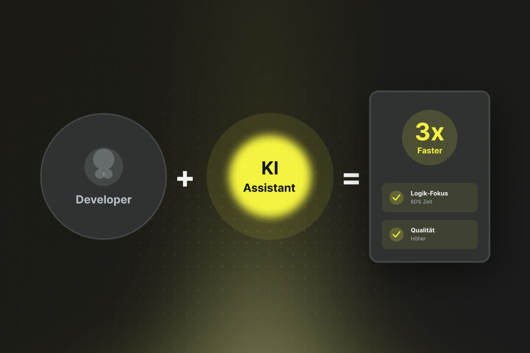
Artificial intelligence is now an established tool in software development, integrated directly into the programming environment. Developers spend less time writing boilerplate code and can instead focus on how the different parts of an application logically interact.
According to the PwC report Digital Product Development 2025, so-called 'Digital Champions' – companies with a high level of digital maturity – are already expecting and achieving an efficiency increase of 31% and a 20% reduction in operating costs.